I love using the Roots theme as a starting point for many of our custom themes we do for our clients. It’s responsive, lightweight, and comes with Bootstrap built in. However, it can be a bit difficult to get started for WordPress beginners (and even experienced themers alike) due to it own system of templates and configurations.
Here is a collection of common adjustments we make.
Disable Responsive Grid
While it’s a great responsive theme, you may not always want a responsive grid system. Easily disable it by commenting out a line in lib/scripts.php
function roots_scripts() {
  wp_enqueue_style('roots_bootstrap', get_template_directory_uri() . '/assets/css/bootstrap.css', false, null);
  // wp_enqueue_style('roots_bootstrap_responsive', get_template_directory_uri() . '/assets/css/bootstrap-responsive.css', array('roots_bootstrap'), null);
  wp_enqueue_style('roots_app', get_template_directory_uri() . '/assets/css/app.css', false, null);
...
}
Comment out or delete the line that begins with “wp_enqueue_style(‘roots_bootstrap_responsive'”.
This line of code is responsible for “bootstrap-responsive.css”
You may want also want to update the viewport settings in templates/head.php
The default viewport settings will scale the page to the browser or device width, causing rendering issues on mobile and tablet devices. If you replace it with the following code, it will scale the page to a specific width and render it consistently on mobile/tablet devices. Update the width accordingly to the needs of your design.
Sidebar on Homepage
Roots theme comes without a sidebar on the homepage by default. Edit lib/config.php and comment out or delete ‘is_front_page’ from the roots_display_sidebar() function:
function roots_display_sidebar() {
  $sidebar_config = new Roots_Sidebar(
    array(
      'is_404',
      //'is_front_page'
    ),
    ...
}
This function tells Roots which conditions to exclude the sidebar, so removing that line will display it on the homepage.
Widgets Side by Side in Footer Using the Grid System
Some sites require widgets side by side in the footer area. Bootstrap comes with a handy set of “span” classes (span3, span4, span5, etc) that defines widths (number of columns of the grid) of the tags they’re assigned to and floats them to the left.
To take advantage of this, Bootstrap requires them to be wrapped in a “row” class and you need to assign the classes to the widgets.
Update your templates/footer.php and wrap the dynamic_sidebar(‘sidebar-footer’) with a div tag.
<footer class="content-info" role="contentinfo">
<div class="container">
<div class="row">
<?php dynamic_sidebar('sidebar-footer'); ?>
</div>
<p>© <?php echo date('Y'); ?> <?php bloginfo('name'); ?></p>
</div>
</footer>
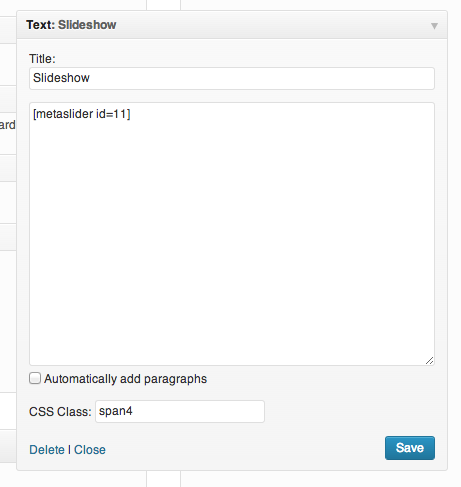
Now add the class to the widgets. Install and activate the Widget CSS Classes plugin. This allows you to set CSS classes on each widget you place in your theme.
4 replies on “WordPress Roots Theme Configuration Tips”
Great article! I love roots! Thank you!
Nice Article ! Let me check the theme
In base.php is DIV container with setted width, but I want to full screen content on home page. How can I do this?
set the div with class container to container-fluid or create a parent div with full width