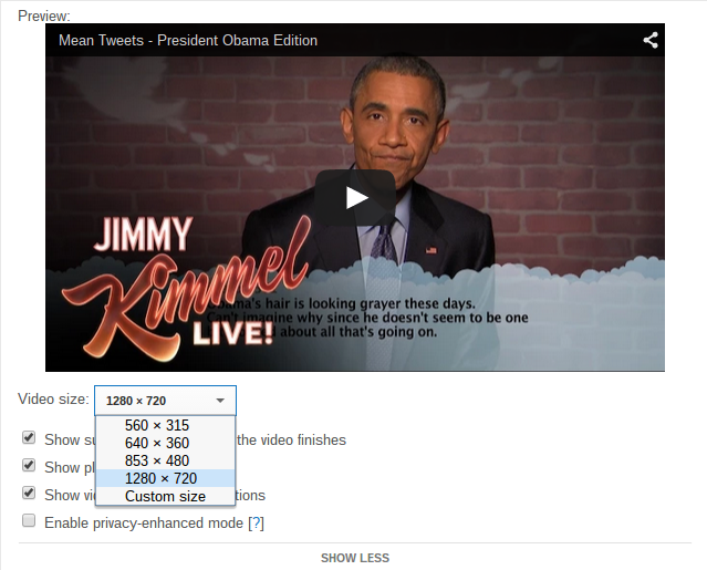
Responsive videos seem to be an after-thought for many websites. While text and images are easy to resize to mobile and tablet screens, videos have always required extra work. Even popular video sharing sites like Youtube.com still don’t have an easy “responsive” option and require specifying a video dimension for embedding.

Luckily, the 3.2+ version of Bootstrap solves that with a few simple classes you apply. To use them, wrap the <iframe> code with a div and give it the class of embed-responsive and either embed-responsive-16x9 (for widescreen) or embed-responsive-4by3 (if your videos are stuck in the 1980s format).
<!-- 16:9 aspect ratio -->
<div class="embed-responsive embed-responsive-16by9">
  <iframe class="embed-responsive-item" src="..."></iframe>
</div>

<!-- 4:3 aspect ratio -->
<div class="embed-responsive embed-responsive-4by3">
  <iframe class="embed-responsive-item" src="..."></iframe>
</div>
The embed-responsive-item part is optional. Since the only requirement is the outer wrapper for the video, it’s easy to globally apply this previously embedded videos, saving a ton of work with legacy content. This little snippet of jquery using .wrap() will wrap any iframe for you.
$("iframe").wrap("<div class='embed-responsive embed-responsive-16by9'></div>");
If you’re upgrading from an older version of Bootstrap and compiled your CSS from the LESS source files, you’ll need to include the responsive-embed.less file in your bootstrap.less file so the new styles are available.